


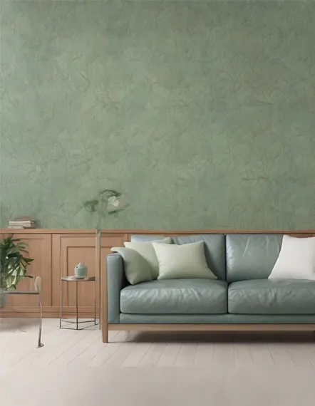
Limewash and Mineral
Soft, cloudy depth that shifts with the light. The finish everyone is asking about.
Choosing a Color
Color is where most projects stall. A shade that looks right on a card can read completely differently on a wall, and New England light is a large part of why. Rooms here get low winter sun for months, and a color chosen in July can feel cold by January.
The families below are a starting point for house paint color ideas in Framingham MA and across MetroWest, grouped by how they behave rather than by brand. They are shown as guidance for a conversation, not as a product list.
These swatches are shown as color guidance. They are not a product catalog and do not represent any particular paint brand. Final color and product selection happens with you during the estimate.
Color Families
The safest place to start in a New England home, and the family that behaves best under low winter light.
Gallery White
A white with warmth in it, so it does not read blue in north facing rooms.
Linen
Soft and unfussy. Sits well next to original wood trim.
Greige
Grey and beige at once. The most forgiving whole home color there is.
Alabaster
The softest step past white. Keeps ceilings and trim from looking stark.
Mushroom Taupe
Earthy and calm. The neutral that has been winning rooms lately.
Ivory
Classic and quiet. The white that makes trim and ceilings feel finished.
Putty
A deeper linen with grey in it. Calm in rooms with strong daylight.
Color at a whisper. Blush, soft yellow and pale green work as gentle accents in bedrooms, nurseries and baths.
Blush
A quiet pink that reads warm rather than sweet. Bedrooms love it.
Soft Yellow
Morning light in a can. Lifts kitchens and breakfast corners.
Eucalyptus
A pale green with grey in it. Fresh without being minty.
Peach
Soft warmth for a nursery or a breakfast nook.
Powder Blue
The gentlest blue there is. Bedrooms and ceilings love it.
Lilac Mist
A grey lilac that reads calm rather than sweet.
Warmth with more presence, for rooms that can carry a stronger color without closing in. The family that grew the most this decade.
Warm Sand
Sunlit even on a grey day. Works in hallways with little natural light.
Terracotta
A committed color. Best on one wall, or in a room you want to feel enclosed.
Clay
Terracotta's softer cousin. Warmth that does not close the room in.
Ochre
Golden and grounded. One wall of it changes a whole room.
Caramel
Toasted and cozy. Beautiful in dining rooms with wood furniture.
Sienna
Deep earth tone for a single wall or a hallway with good light.
The family that has moved furthest into favor lately, and the one that suits older houses best.
Sage
Quiet and easy to live with. Reads almost neutral in bright rooms.
Forest
Deep and traditional. Strong on cabinetry, a front door or a study.
Olive
Deeper than sage, softer than forest. Beautiful on cabinetry.
Celadon
A pale green with grey behind it. Fresh without being cold.
Moss
Between sage and olive. Natural next to wood tones.
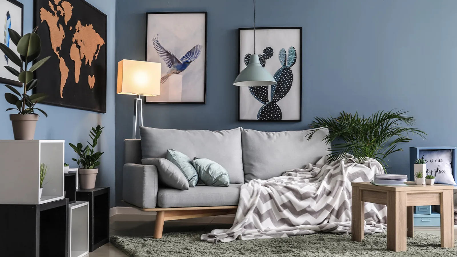
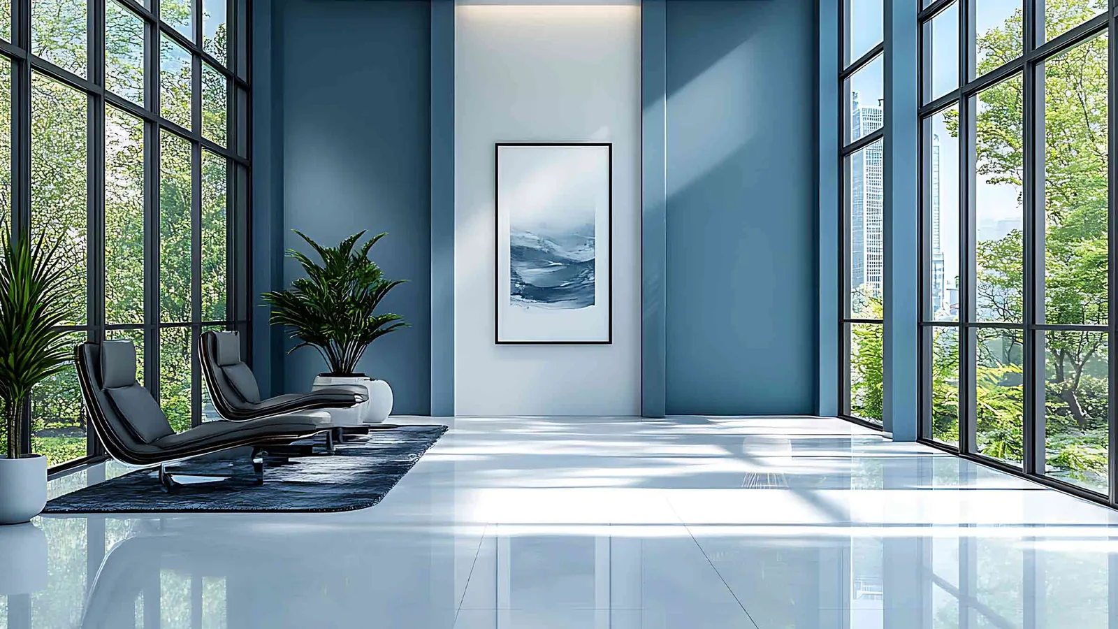
A New England constant, from pale coastal tones through to the deep navy on half the front doors in the region.
Seafoam
Light with a green cast. Common in bathrooms and bedrooms.
Sky
Clear and cool. Needs a warm trim color to balance it.
Denim
Mid tone blue with enough grey to stay calm.
Harbor Navy
The classic exterior accent. Shutters, doors and trim.
Steel Blue
A dependable mid blue for offices and bedrooms alike.
Slate
Blue grey with real depth. Handsome on cabinetry.
The burnt cement look, from pale mist through to poured concrete. Modern rooms and finished basements wear it well.
Mist Gray
The concrete family's lightest tone. Modern without feeling cold.
Burnt Cement
The burnt cement look in a flat tone. Pairs with wood and white.
Stone
Warm grey with a mineral cast. The lightest concrete look.
Concrete
The poured concrete tone. Modern basements and offices wear it well.
For contrast rather than coverage. Used on a single element, a door or one wall, they make everything around them look intentional.
Charcoal
Almost black without the hardness. Strong on exterior trim and doors.
Oxblood
Deep, moody red. A front door color with real presence.
Espresso
Dark roast brown. Grounding on a door or a bookcase wall.
Plum
A muted plum for moody dining rooms and powder rooms.
Almost any color can be matched and mixed. Bring a paint chip from any brand, a photo you love, a fabric, even a favorite mug. During the free estimate we look at it in your light, on your surface, and match the tone and the right finish for the job.
Beyond Flat Color
Limewash, mineral textures and statement patterns are the finishes people are asking about most. If one of these is on your mind, bring it up during the estimate and we will talk through where it works best.
Soft, cloudy depth that shifts with the light. The finish everyone is asking about.
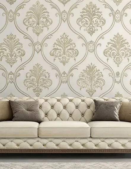
Traditional pattern with a New England pedigree. At home beside original trim.
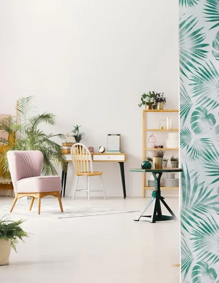
Leafy prints that bring a room to life on a single accent wall.
Before You Decide
Cool, steady light all day. Warm whites and greiges keep these rooms from reading grey and flat.
Strong, warm light that intensifies a color. A shade can look a full step deeper here than on the card.
Low sun for months. Cool greys that felt crisp in summer can turn heavy from November onward.
Original trim in older MetroWest homes carries its own undertone, and the wall color has to sit next to it.
Bring the color to the estimate. We will look at the room, the light and the surface, and tell you honestly how it will behave.
Free Estimate
A visit, a written scope and no obligation. We will look at the space, talk through what you want, and tell you honestly what it takes.